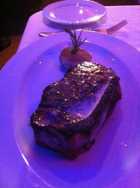
We went to a fancy schmancy restaurant. Of course, we ordered steaks.
Here is how they were presented . . .
Is it just me or does that steak look lonely next to that tiny clove of garlic?
Seems like a big plate. In graphic design, I believe they call that an abundance of “white space.”
Who wants white space on their plate?
THIS, folks, is why I prefer my steaks at home.
Oh yeah, and they taste better there, too.
So there.


